Lies, Damn Lies And Charts
Even Nobel Prize Winners Can Be Graphically Impaired

STOCKS CRASH THEN RALLY IN 8,246,740-SHARE DAY; MONEY GOES TO 20 PER CENT; MARKET SETS NEW RECORD
Stocks Dumped as Loan Rate Mounts, Sending Wide List Down.
BANKERS AID RECOVERY
Heavy Buying Orders in Five Pivotal Securities Help Stem Tide in Last Hour,
300 ISSUES AT YEAR’S LOW $13,874,000
Bond Sales Also Biggest for 1929, With Many Declines.
The Events of the Day: - Credit Curb the Big Factor. - Opening is Closely Watched. Tickers Fall Far Behind. - Rally Comes Unexpectedly. - Feature Is Tremendous Volume. - Easier Credit Looked For. - 1921 Situation Paralleled.
So said the New York times. Is this 1929 all over again? I don’t know but last week was sure scary. We can take some comfort from the fact the policy makers are trying to ease the crunch, not make it worse, as they did back then. This isn’t a post about that, though. This is a post about how some people are using charts to whip up fear. I was at the IMF meetings over the weekend and some of the speakers seemed to have a vested interest in making things worse. Robert Shiller, a Yale economist is famous for creating the Case-Shiller home price index, a widely used measure of the current housing crisis. He spoke on a panel and presented a chart overlaying stock prices from 1929 with stock prices now and suggested that Monday might be the “big one.” Here is what he showed:
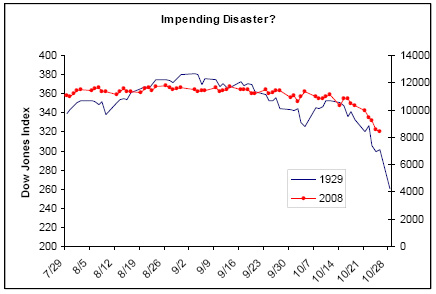
Looks like we are sliding down the same precipice. We may be sliding down, but this chart shows absolutely nothing. In fact, it lies by committing the sin of using different scales for the two series. Here is what happens when we make the percentage range the same for the Dow then and now:
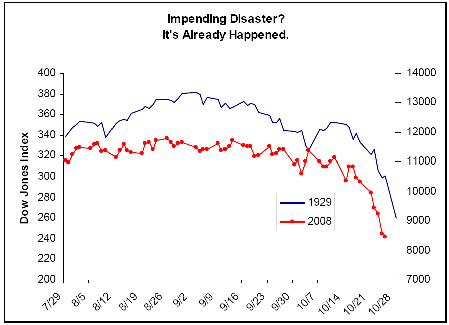
So, while we haven’t had the same 1-day percentage fall we saw on Black Monday, the Dow is already down every bit as much, and more, as it was back then. Why would a Yale professor show something so misleading. To sell his books, I think. If Monday had been a puke then he could say “see!”1
Then the next speaker did the same damn thing! He showed a 100-year chart of the Dow. If you look at the chart below you might draw the inference that the last 15 years have been a crazy run-up for stocks and a reversion to the long-term trend would be catastrophic.

Again, nonsense! You can’t show long term growth trends on a linear scale like this. That’s because the economy grows over time. There isn’t a “normal” level for stocks. There is a “normal” growth rate. To show this concept properly you need to use a logarithmic scale, a “log chart.” A proper depiction looks like this:
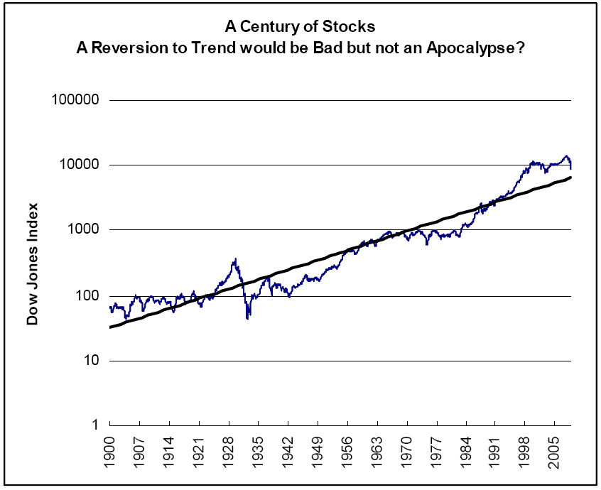
Stocks look far less overvalued in this chart and the crash of 1929, which is invisible in the upper chart, is shown in it’s proper context vs. today. As of today, the ’29 crash looks far more cataclysmic. This chart is scary enough, though. A reversion to trend would take to Dow to 7000. This is a post about chart lies, not stock prognostication, though.2
Why would anybody show the linear-scale chart? Turning on a log scale is a a one-click operation in Excel. Is it too exotic? The audience was financial professionals. It’s just inexplicable. I am a fan of good data visualization and you should be too.
It won’t surprise you to learn there is a cult of data graphic geeks out there. Their guru is another Yale professor, Edward Tufte. Their arguments about the nuances of bar charts can resemble religious doctrinal disputes.
Also check out Junk Charts by Kaiser Fung for more data viz sins.